


Someone passes the window at four in the afternoon. They are not shopping. They have a few seconds of attention to give, and in that time a retail interior either catches their eye or it does not.
September 2026
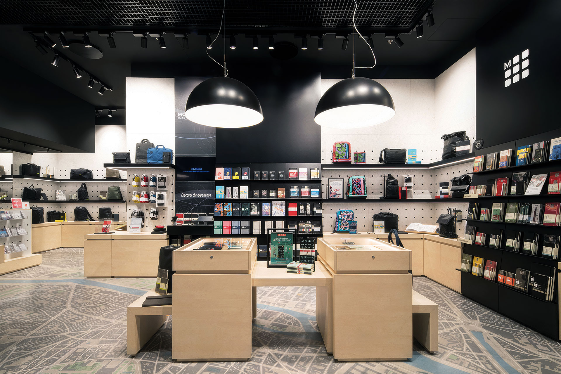
Someone passes the window at four in the afternoon. They are not shopping. They have a few seconds of attention to give, and in that time a retail interior either catches their eye or it does not.
Lighting a retail space is the work of deciding where someone looks, and for how long. Everything technical in the design serves that one decision: attention has to be directed through architecture that was resolved before the lighting was specified.
The window is the only part of a retail space that has to work on someone who has not decided to come in.
Its first obstacle is visual adaptation. At midday the eye is set for daylight, and an interior lit to a comfortable working level looks like a dark cavity behind a reflective plane of glass. The display only works when its luminance sits well above the level the eye is adapted to, which is a higher figure than instinct suggests. By evening the relationship inverts, street levels fall, and the window that drew people in at four glares at eight.
Extreme conditions widen that gap. At the Concept Store in Pontresina, in the Engadin, we developed the lighting for a window that faces snow for months of the year, where reflected snow drives exterior luminance far beyond anything an urban street produces and midwinter brings darkness from mid afternoon. No luminaire changes between those two states. Only the levels do, which is why a window specified without scene control is wrong for half of a day.
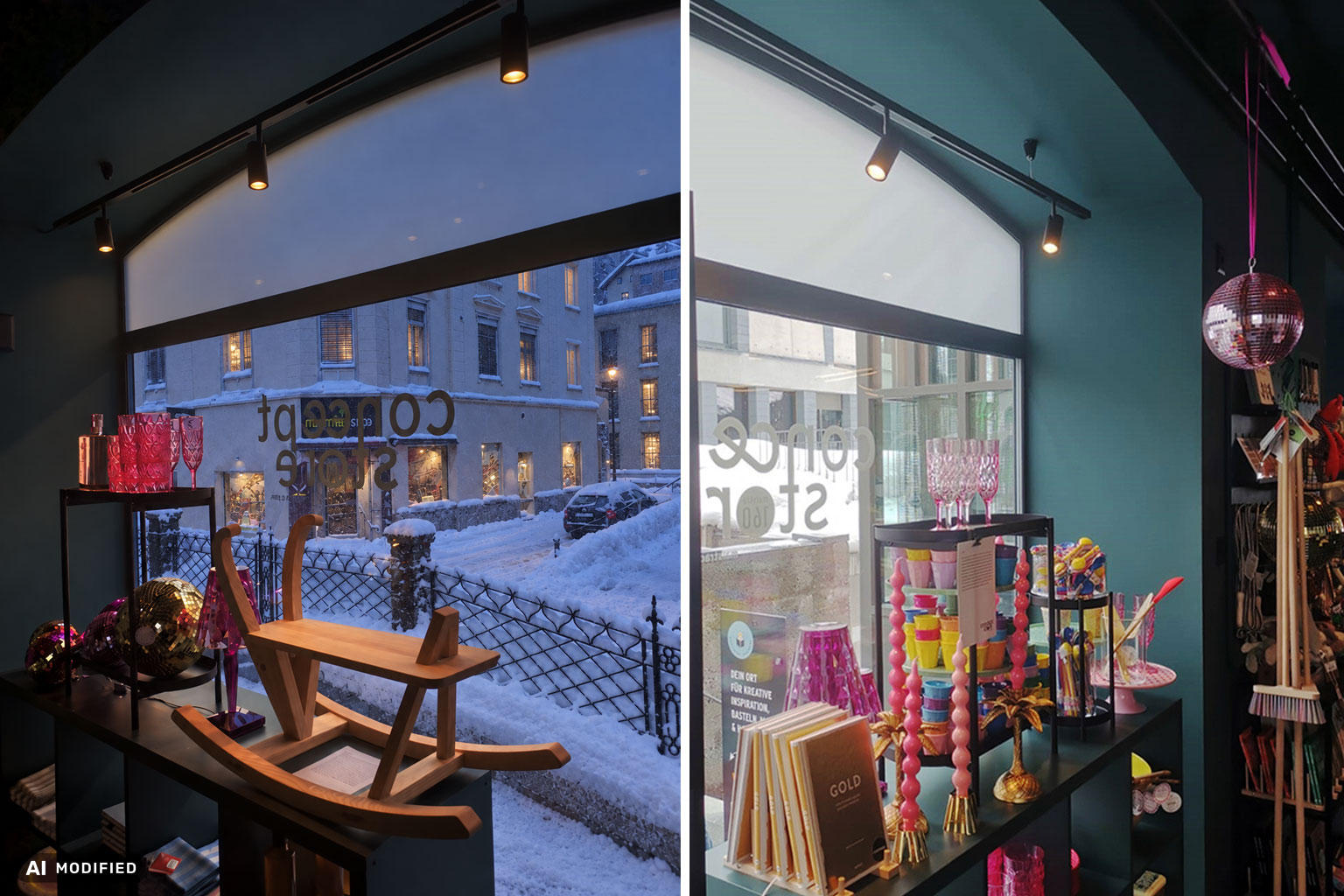
The glass is the second obstacle, because in daylight it mirrors the street and a display competing with the reflection of the building opposite loses. There are two ways to win that. One is to position luminaires outside the viewing angle so their image never appears in the glass. The other is to lower the reflectance of everything around the display, which is the approach at Pontresina, where a deep teal return absorbs what the glass would otherwise bounce back and the black Iris Track 48V Iris Track 48V bodies sit against it without adding a second image. The track follows the arched head of the opening rather than cutting a straight line across it, keeping the spots close above the display, where a short throw produces hard accent without spilling onto the glass.
Inside, there is more product than anyone can absorb, and the lighting sets the order in which it is read. Where workplace lighting often values greater uniformity, on a sales floor excessive uniformity becomes a failure state, because light that treats every surface equally communicates nothing and the interior reads as storage.
Hierarchy is built from contrast. An accent running three to five times the surrounding ambient identifies an object as worth attention. Beyond that range the interior turns theatrical, which suits a flagship and undermines another kind of space. Below it, the emphasis stops registering. Whether that separation survives comes down to aiming, since a beam distribution chosen against ceiling height rather than against the depth of the bay it serves throws half its output onto the floor and raises the very ambient level the accent was meant to stand clear of.
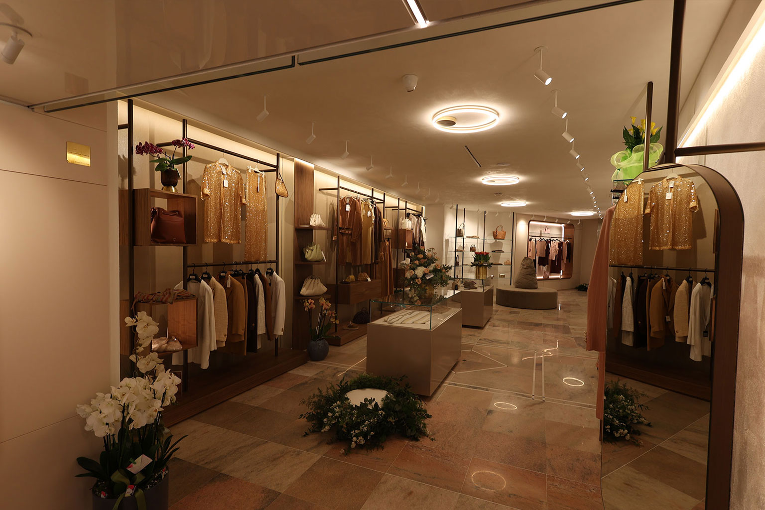
Colour temperature follows the same logic, chosen in relation to the product rather than the room alone. Warm light, typically in the 2700K to 3000K range, can deepen the character of leather, wood and textiles, while more neutral temperatures around 3500K to 4000K can support the accurate reading of stone, metal and fresh food.
What changes from one retail interior to the next is the material in front of the light beam.
Ceramics are a case in point. At the Astier de Villatte store in Milan, where we developed the lighting design directly with the client, handmade objects are picked up, turned over and examined in the round at close range, so the light has to describe glaze, edge and irregularity. Surface quality is the product, and a source that flattens it removes the reason the object costs what it does.

Food reverses the priority. Abundance is the display, and a perishable product has to look as though it were cut that morning, which is a colour rendering problem before anything else. CRI above 90 is a starting condition, and R9 determines whether reds arrive as reds or as a dull brown. At the Fromagerie Famille Mesot in Bulle, with Repond & Nyckees Architectes, we built the scheme around the counters, with accent on the display below and Newton System suspensions giving the volume above a generous ceiling rather than the compression of a cellar.

A beam aimed at a plinth in March is aimed at nothing in May.
The plinth has moved. The rail behind it has come down, a capsule collection has taken the front of the plan, and the light that was describing a bag now describes a stretch of empty oak. Nothing has failed. The interior has changed beneath a lighting layout that cannot change with it.
This is the condition most retail lighting operates in, and it is why the installation has to stay loose. Low voltage track at 48V allows a spot to be lifted, repositioned by a metre, reaimed and returned during trading hours. Addressable control does the same thing in time rather than in plan, holding one scene for midday and another for the final hour when the glazing goes dark and the interior has to carry itself.

At the Boutique Eleonora Bonucci in Perugia, developed with MApa Architetti, the track was recessed into the ceiling plane rather than suspended below it. Newton Track 48V spots run flush within the recess and Into luminaires carry the general layer. The track follows the ceiling instead of hanging beneath it, so flexibility costs the architecture nothing.
The decision belongs at first fit. Specify more track length and more circuit capacity than the opening layout requires, because the second season invariably wants light where the first season did not.
Not every retail interior wants that freedom, and a jewellery store wants the opposite of it.
At the Gioielleria Ungaro in Pagani, with Arch. Ulderico Lepreri, the pieces sit in niches and vitrines whose positions were decided when the joinery was drawn. Nothing moves seasonally, so the lighting was built into the cabinetry: linear profiles integrated beneath the shelves, small recessed Star spots inside the cases, Egotube surface cylinders picking up the circulation, and a dense field of Top miniatures set into the window soffit.

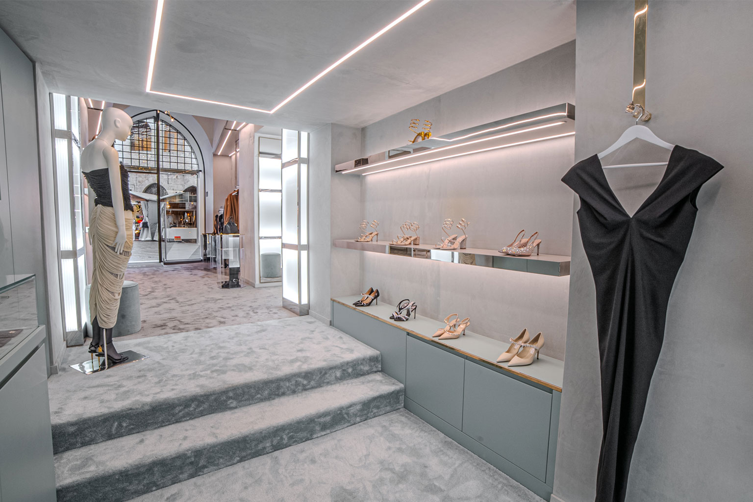
In high end retail the display is deliberately sparse, and the light runs warm and separates hard. The plaster, the stone, the joinery and the proportions are also under scrutiny, and equipment on the ceiling competes with every one of them.
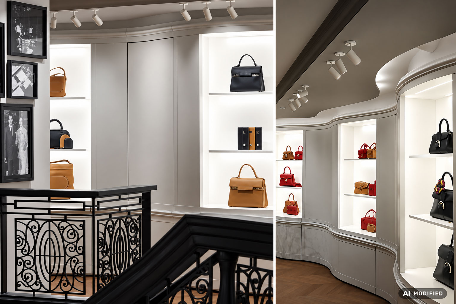
At the Delvaux boutique in New York, with architecture by Vudafieri Saverino Partners and lighting design by Studio Amort, the answer was to put the apparatus away. Newton spots were recessed into the ceiling, leaving a surface with almost nothing on it, so the light arrives without a visible source and the maison’s own material language creates the space.
A retail interior is judged in seconds by someone who will never consider the lighting at all.
That is the standard. When the scheme is right, nobody looks up. They look at the leather, the glaze, the stone, the detail the designer spent months resolving, and the merchandise does the talking.
September 2026

July 2026
June 2026